
The Importance of Effective Banner Design for Your Business
Banners have long been a staple in marketing, serving as an effective tool for brand promotion, product launches, and event advertising. They’re versatile, cost-effective, and can be used across various platforms, from websites to social media to physical displays. When designed thoughtfully, a banner can grab attention, convey essential information in seconds, and drive potential customers to take action. With this blog, we will discuss the Dos and Don’ts of Designing a Banner for Your Business.
In today’s competitive landscape, where visuals are key to capturing short attention spans, the quality of your banner design can significantly impact your business’s success. Effective banners don’t just look good; they’re purposefully crafted to resonate with your target audience and motivate them to engage with your brand. Here, we explore the dos and don’ts of designing a banner, ensuring that your marketing efforts are both visually appealing and strategically effective.
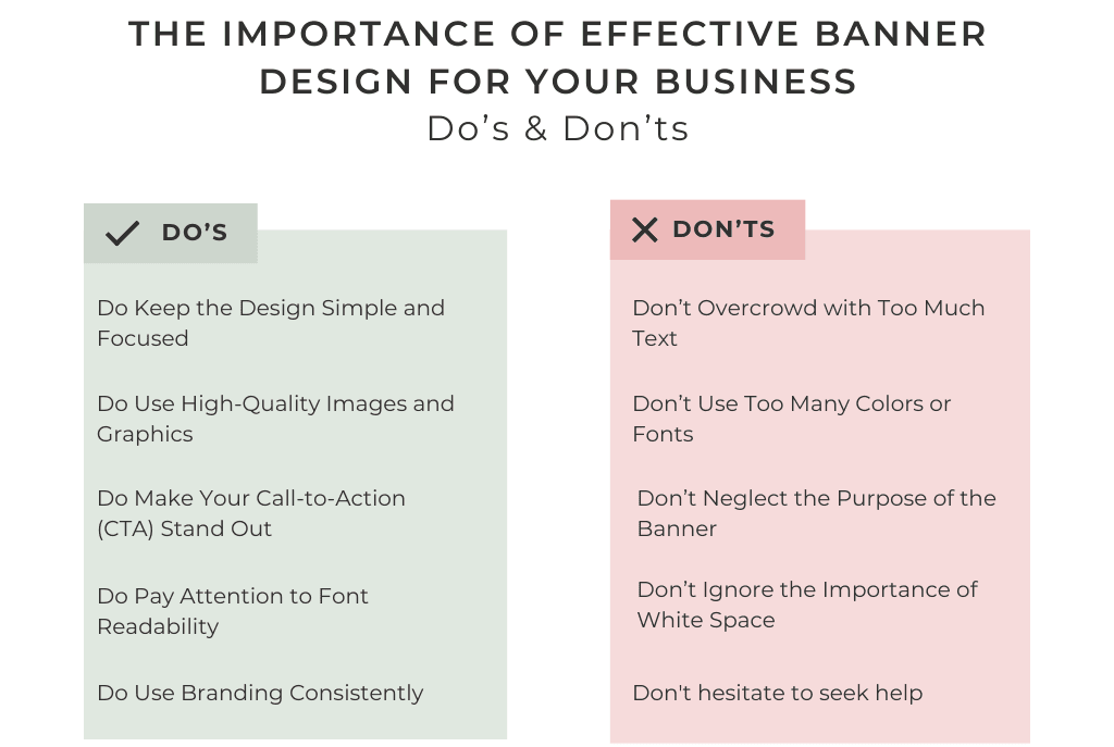
Dos of Designing a Banner
1. Do Keep the Design Simple and Focused
One of the most common mistakes in designing a banner is overloading it with information or too many visual elements. A cluttered banner confuses viewers and dilutes the impact of your message. Instead, aim for simplicity. Focus on one main message, whether it’s a promotion, a product launch, or brand awareness.
- Use minimal text: Stick to short phrases or bullet points that highlight key information.
- Avoid excessive graphics: Too many visuals can distract viewers from your main message. Use only images that enhance your message, such as a product photo or brand logo.
- Utilize negative space: Leave ample blank space around your main elements. This “breathing room” makes the banner appear cleaner and helps draw attention to the central message.
Keeping your banner design simple ensures that your message is easy to digest at a glance, making it more effective in engaging viewers.
2. Do Use High-Quality Images and Graphics
A banner is a visual representation of your brand, so using low-quality or blurry images can reflect poorly on your business. High-resolution images and professional graphics enhance the perceived quality of your banner and, by extension, your brand.
- Invest in high-quality images: If you’re featuring a product, make sure it’s a high-resolution image with good lighting. Avoid using stock images that feel generic; if possible, invest in professional photography.
- Use vector graphics: Vector images can be resized without losing quality, making them ideal for banners that might need to be scaled.
- Be mindful of colors: Choose colors that align with your brand and complement each other. High contrast between background and foreground colors improves readability.
Quality visuals are crucial for creating a polished, professional look, ensuring that your banner stands out in a crowded environment.
3. Do Make Your Call-to-Action (CTA) Stand Out
Every effective banner includes a strong call-to-action (CTA) that tells viewers what to do next, whether it’s “Shop Now,” “Learn More,” or “Sign Up Today.” Your CTA should be prominent and easy to spot, guiding potential customers to take immediate action.
- Use contrasting colors: Make your CTA button or text stand out by using a color that contrasts with the rest of the banner. This draws the eye directly to the CTA.
- Choose action-oriented language: A compelling CTA is specific and action-driven. Phrases like “Get Your Free Trial” or “Explore Our Collection” are more enticing than a generic “Click Here.”
- Ensure CTA placement is logical: Place your CTA in a location where it’s naturally visible, such as the bottom center or right side of the banner.
A well-crafted CTA is a powerful motivator, driving viewers to engage with your business and move through the sales funnel.
4. Do Pay Attention to Font Readability
Font readability is essential for any banner, as it determines how quickly and easily viewers can understand your message. A banner is typically viewed from a distance or in a scrollable digital space, so readability is key.
- Choose clean, sans-serif fonts: Sans-serif fonts (like Arial or Helvetica) are generally easier to read from a distance than serif fonts. Stick to one or two font types for a cohesive look.
- Limit font sizes: Use larger fonts for main headlines and slightly smaller fonts for supporting information. The CTA font should stand out but remain proportionate to the rest of the text.
- Avoid script or decorative fonts: These can be difficult to read, especially on smaller screens or from a distance.
Readable fonts ensure that viewers can quickly understand your message, which is essential for an effective banner.
5. Do Use Branding Consistently
A banner is an extension of your brand, so incorporating consistent branding elements (such as your logo, brand colors, and font styles) reinforces brand recognition.
- Use brand colors and logo: Colors and logos associated with your brand make your banner instantly recognizable.
- Maintain brand tone: If your brand has a playful tone, reflect this in your banner design. Consistent tone and style build familiarity with your audience.
- Include brand tagline or motto: If applicable, a brief tagline can strengthen brand identity and make the banner more memorable.
Consistency in branding across all marketing materials helps build trust and loyalty among your audience.
Don’ts of Designing a Banner
1. Don’t Overcrowd with Too Much Text
A banner is not a brochure; it’s meant to communicate quickly and effectively. Too much text can overwhelm viewers and reduce engagement.
- Stick to key points: Include only essential information, such as a brief headline, a CTA, and perhaps one or two supporting phrases.
- Use visuals to convey information: If possible, replace text with icons or images that communicate the same idea.
- Avoid long sentences: Instead of a paragraph, use short, impactful phrases to make your point.
Less text leads to better engagement by allowing viewers to absorb the message at a glance.
2. Don’t Use Too Many Colors or Fonts
While colors and fonts can make your banner more appealing, using too many can create a chaotic, confusing design. Aim for a cohesive look with a limited palette and font selection.
- Stick to two or three colors: Choose a primary color, an accent color, and possibly one neutral background color.
- Limit fonts to one or two styles: This keeps the banner looking clean and professional. Too many fonts can make it hard to read.
- Choose colors that work together: Use a color wheel to select complementary colors that enhance rather than clash with each other.
A focused color and font scheme enhances readability and makes your banner look more polished.
3. Don’t Neglect the Purpose of the Banner
Every banner should have a clear goal, whether it’s to inform, promote, or invite. Your design should be guided by this goal to ensure that the message aligns with the banner’s purpose.
- Identify your main objective: Decide whether the banner is for brand awareness, an event, or a sale, and build the design around this purpose.
- Keep content relevant: Avoid adding elements or text that don’t directly support the main goal of the banner.
- Highlight the purpose clearly: Make sure the main message (e.g., “50% Off Summer Sale”) is the first thing viewers see.
Aligning design elements with the banner’s purpose keeps the message clear and effective.
4. Don’t Forget to Optimize for Different Platforms
Banners are displayed on various platforms, and each platform may have different specifications. Make sure your banner is adaptable and optimized for each platform.
- Adjust size and resolution: Ensure your banner looks crisp on both digital and physical platforms by choosing the right dimensions and resolution.
- Create multiple versions if needed: Design platform-specific versions, especially for digital use, where dimensions can vary significantly.
- Test readability on different devices: Check your banner on smartphones, tablets, and desktop computers to make sure it’s readable on all devices.
Platform optimization ensures your banner maintains quality and impact, no matter where it’s viewed.
5. Don’t Ignore the Importance of White Space
White space, or space around elements, is crucial for making your banner look clean and professional. Crowding elements can overwhelm viewers, while white space makes the design more approachable.
- Avoid filling every inch of space: Leave blank areas around your text, images, and CTA.
- Use white space strategically: White space can help guide the viewer’s eye toward key elements.
- Keep the layout balanced: A balanced design is easier to look at and keeps the focus on your message.
White space enhances readability and helps important elements stand out, improving overall banner effectiveness.
Conclusion: Crafting a Perfect Banner for Your Business
Designing a banner involves a balance of aesthetics and strategy. By focusing on simplicity, high-quality visuals, a clear CTA, and readability, you can design a banner that not only captures attention but also encourages engagement. Additionally, avoiding common pitfalls—like overcrowding text, overusing colors, and ignoring platform specifications—ensures that your banner remains professional and impactful.
Remember, a great banner should communicate your message within seconds,
Ready to design an eye-catching banner for your business? Let our expert designers bring your vision to life. Contact us today for professional banner design services.