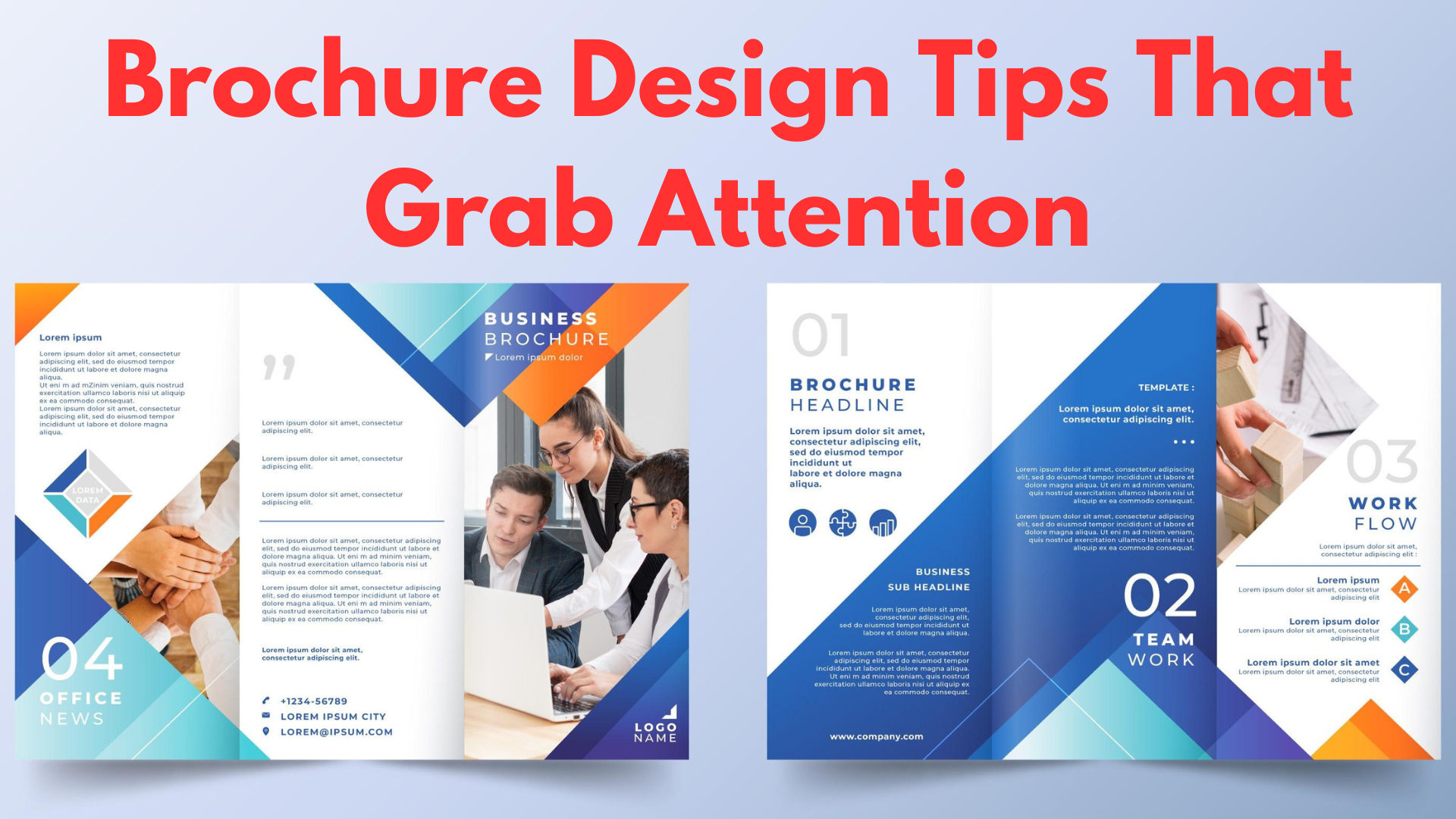
In a world dominated by digital marketing, brochures remain one of the most effective ways to make a lasting impression. Whether you’re handing them out at events, including them in packaging, or mailing them to potential customers, a well-designed brochure can grab attention and convey your message with impact. But not all brochures achieve this goal—some end up tossed aside because they fail to capture interest.
So, how do you create a brochure design that stands out? The key lies in effective brochure design that combines engaging visuals, a well-structured layout, and compelling content. In this guide, we’ll walk you through brochure design tips that will help you create an eye-catching marketing tool that effectively represents your brand.
The Key Elements of an Effective Brochure
A truly attention-grabbing brochure design isn’t just about looking good—it needs to communicate your message clearly and leave a strong impression. Here are the essential components of a successful brochure layout:
1. Clear and Engaging Headline
Your brochure’s headline is the first thing people see, and it needs to immediately capture their attention. A vague or generic headline won’t entice anyone to keep reading. Instead, focus on a bold statement or a question that speaks directly to your audience’s needs.
For example, instead of “Our Company’s Services,” try “Boost Your Sales with Our Cutting-Edge Marketing Solutions!”
2. Balanced Layout and Structure
A cluttered or confusing layout can turn potential customers away. The best brochure designs use a clear visual hierarchy, ensuring that the most important elements—like headlines, images, and CTAs—are easy to find.
- Use sections and columns to organize content.
- Maintain a balance between text and visuals to avoid overwhelming the reader.
- Keep margins and spacing consistent to create a professional look.
3. High-Quality Visuals
Images play a significant role in effective brochure design. Low-quality, pixelated images can make your brand look unprofessional, while high-quality visuals can instantly elevate your brochure’s appeal.
- Invest in professional photography or use high-resolution stock images.
- Incorporate icons and illustrations to make complex information digestible.
- Ensure that your images align with your brand’s message and tone.
4. Concise and Persuasive Content
People don’t have time to read long paragraphs. A great brochure design includes short, engaging copy that quickly conveys key information.
- Use bullet points and subheadings to improve readability.
- Focus on benefits rather than just listing features.
- Keep sentences short and impactful.
Example: Instead of “Our software includes a variety of tools for project management,” try “Manage projects faster with our all-in-one software.”
5. Strong Call-to-Action (CTA)
An effective brochure should guide the reader toward a specific action. Whether it’s visiting your website, calling for a consultation, or making a purchase, your CTA should be clear and compelling.
- Use action-oriented phrases like “Get Started Today” or “Claim Your Free Consultation.”
- Make sure the CTA stands out visually with bold text, a button, or a contrasting color.
Design Tips to Make Your Brochure Stand Out
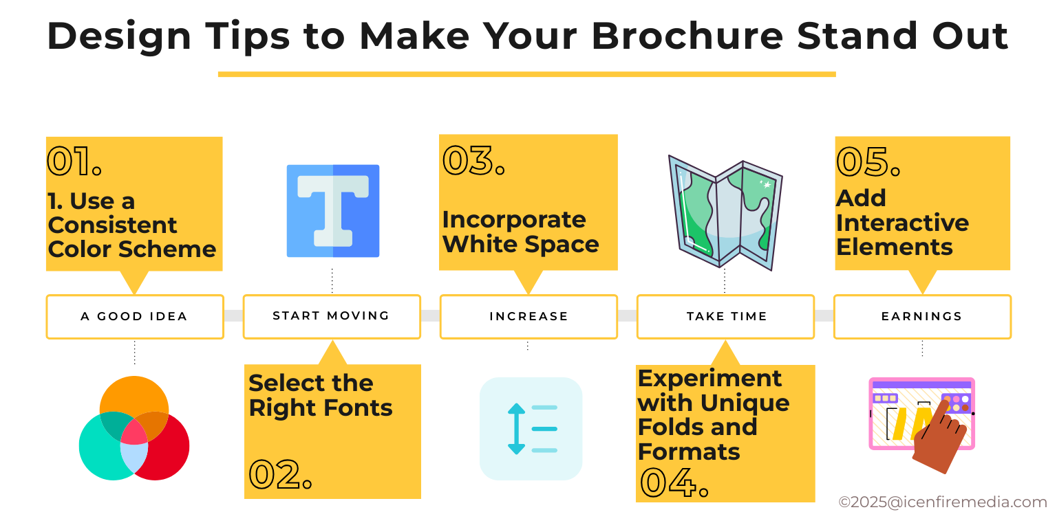
Beyond the basics, there are strategic brochure design tips that can elevate your marketing materials and make them truly eye-catching.
1. Use a Consistent Color Scheme
Colors influence perception and evoke emotions. Your brochure design should reflect your brand’s identity through a cohesive color palette.
- Stick to two to three primary colors to maintain a polished look.
- Consider color psychology—blue conveys trust, red creates urgency, and green symbolizes growth.
- Ensure enough contrast between text and background for readability.
2. Select the Right Fonts
Typography plays a major role in graphic design for brochures. Your font choices should be both readable and visually appealing.
- Use a combination of fonts—one for headlines and one for body text.
- Avoid overly decorative fonts that may be hard to read.
- Ensure consistency by using the same fonts across all marketing materials.
3. Incorporate White Space
White space (or negative space) helps to create a clean and professional design by preventing the brochure from looking too crowded.
- Improves readability by making text and visuals stand out.
- Gives the design a modern and premium feel.
- Helps guide the reader’s eye to key elements like CTAs.
4. Experiment with Unique Folds and Formats
A standard tri-fold brochure is great, but exploring creative formats can make your brochure more engaging.
- Consider z-fold, gatefold, or accordion folds to add an interactive element.
- Die-cut brochures (brochures with unique shapes) can make a lasting impression.
- Think about how the reader will unfold the brochure and guide their journey through the content.
Learn more about Brochure folds.
5. Add Interactive Elements
Modern brochures can do more than just present information—they can encourage interaction.
- Include QR codes that lead to your website, a video, or a digital catalog.
- Use augmented reality (AR) to bring the brochure to life.
- Incorporate perforated sections for coupons, tear-off business cards, or discount vouchers.
Also read:
- How Much Does It Cost to Design a Brochure? A Complete Breakdown
- Top 10 Best Brochure Design Services in the USA
- What is Graphic Design? Everything You Need to Know
Common Mistakes to Avoid in Brochure Design
Even the most creative brochure design ideas can fail if fundamental mistakes are made. Here are some brochure design mistakes that can hurt your marketing efforts and how to avoid them.
1. Overloading with Text and Images
Cramming too much information into a brochure makes it difficult to read and visually overwhelming. A brochure should communicate your message quickly and efficiently.
How to Avoid It:
- Keep copy concise and structured using bullet points or short paragraphs.
- Use white space strategically to create breathing room.
- Choose one or two strong images instead of cluttering the design with too many visuals.
2. Using Low-Quality Visuals
Your brochure design reflects your brand’s professionalism. Blurry, pixelated images or poorly designed graphics can damage your credibility.
How to Avoid It:
- Use high-resolution images that are crisp and clear.
- Hire a professional photographer or purchase quality stock images if necessary.
- Ensure your graphics are in vector format to maintain quality at any size.
3. Ignoring Brand Consistency
Your brochure should align with your brand’s visual identity, including colors, fonts, and logo placement. A brochure that looks completely different from your website or other materials can confuse customers.
How to Avoid It:
- Stick to your brand’s color palette and typography.
- Use your logo and brand elements consistently across all pages.
- Keep the tone and style of writing in line with your brand’s voice.
4. Lack of a Clear Purpose or CTA
A brochure without a clear call to action is ineffective. Readers need to know what to do next after reading your content.
How to Avoid It:
- Make sure your CTA is prominently placed (e.g., “Call us today,” “Visit our website,” or “Claim your free consultation”).
- Use a strong, action-oriented phrase that motivates engagement.
- Ensure that contact details (phone number, email, website, or social media) are easy to find.
Benefits of Hiring Professional Brochure Designers
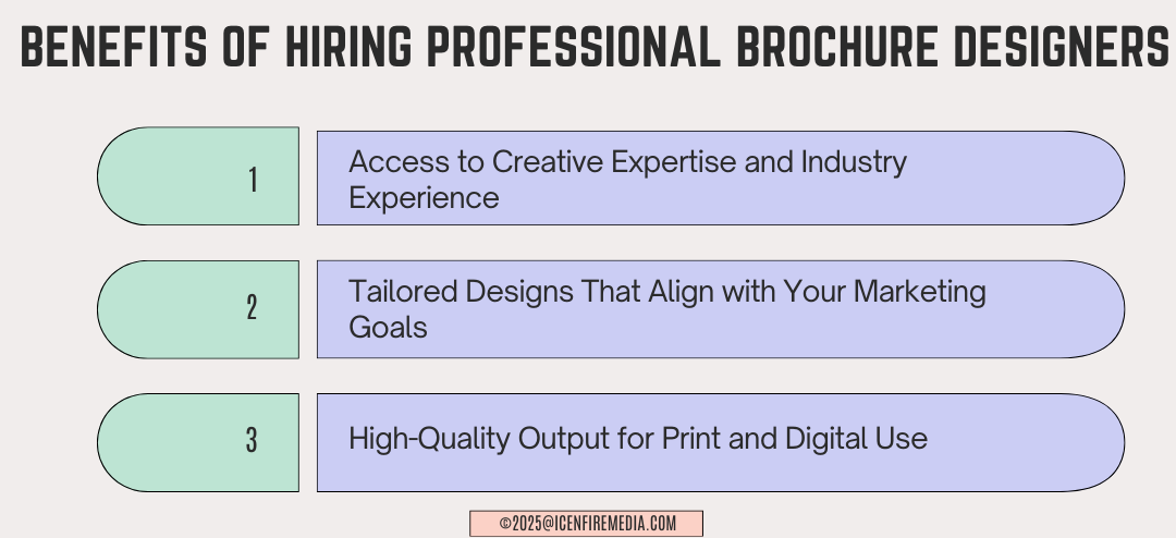
While DIY design tools can be helpful, working with a professional brochure design service ensures that your materials are high-quality, strategic, and visually compelling. Here’s why hiring experts can be beneficial:
1. Access to Creative Expertise and Industry Experience
Professional designers understand layout principles, branding psychology, and marketing trends, ensuring your brochure layout is optimized for impact.
2. Tailored Designs That Align with Your Marketing Goals
A custom brochure designed by an expert will reflect your brand identity, message, and objectives in a way that resonates with your audience.
3. High-Quality Output for Print and Digital Use
Designers use industry-standard software like Adobe Illustrator, InDesign, or Figma to create print-ready brochures with the right resolutions, color profiles, and formatting.
Conclusion: Designing a Brochure That Stands Out
A well-crafted brochure is a powerful marketing tool that can drive engagement, build brand recognition, and generate leads. By applying these brochure design tips, you can create an attention-grabbing brochure that resonates with your audience.
Key Takeaways:
- Keep your layout clean and structured.
- Use high-quality visuals and consistent branding.
- Focus on persuasive content and a strong CTA.
Avoid clutter, poor typography, and weak messaging.
If you want to ensure your brochure design is truly professional, consider hiring a professional designer or using advanced tools to create a polished and impactful design.
Create a professional, attention-grabbing brochure today! Need expert design services? Contact us now for a custom brochure that elevates your brand.
FAQ
An effective brochure design is one that is visually appealing, easy to read, and persuasive. It should include a strong headline, high-quality images, well-structured content, and a clear call-to-action.
The best brochure layout depends on your content and objectives. Tri-fold brochures work well for general marketing, while z-fold and gatefold designs can be used for storytelling and showcasing multiple services.
A professional brochure design service ensures that your brochure is high-quality, brand-consistent, and visually compelling. Designers bring expertise in color psychology, typography, and layout design to make your brochure more effective.
The biggest mistakes in brochure design include overloading with text, using low-quality visuals, lacking brand consistency, and not including a clear CTA.
Interactive features like QR codes, augmented reality (AR), and perforated sections add engagement and functionality to a brochure, making it more appealing and useful for the reader.